Hundreds of roles edited one by one. Now it takes at most 8 clicks.

A one-week sprint to design a multi-edit feature for a fintech client portal, from research to user testing.

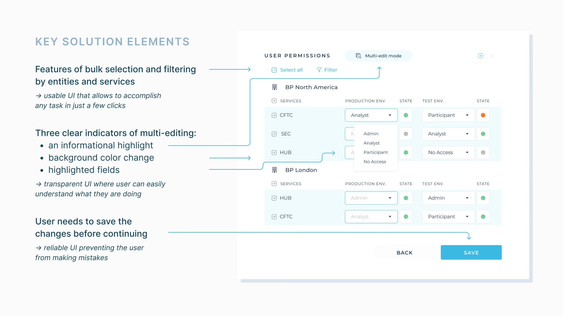
Key solution elements of the UX/UI of the new multi-edit feature
The original UI of the software without the bulk-editing feature
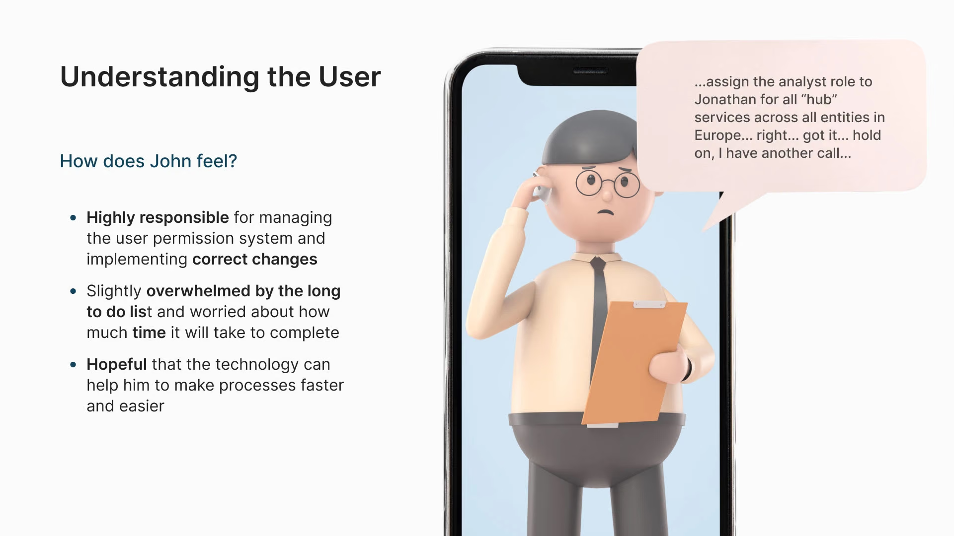
John, the operations manager: how does he feel?
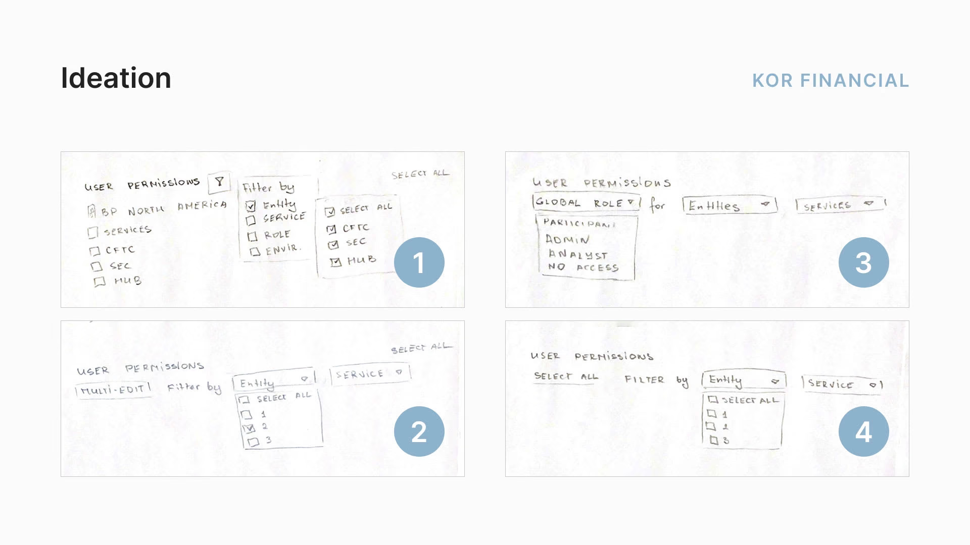
Paper sketches exploring the multi-edit feature
KOR Financial multi-edit result

01Overview

From complex needs to an intuitive interface

KOR Financial is a fintech B2B startup whose software simplifies reporting to trade repositories. In its client portal, admins manage users, entities and permissions, but the portal had no way to edit many things at once, so admins had to change hundreds of roles one by one. Easy reporting is KOR’s core value, so this gap put client retention at risk.

The multi-edit feature I designed means even the largest jobs take at most 8 clicks, where before it took roughly two clicks per item.
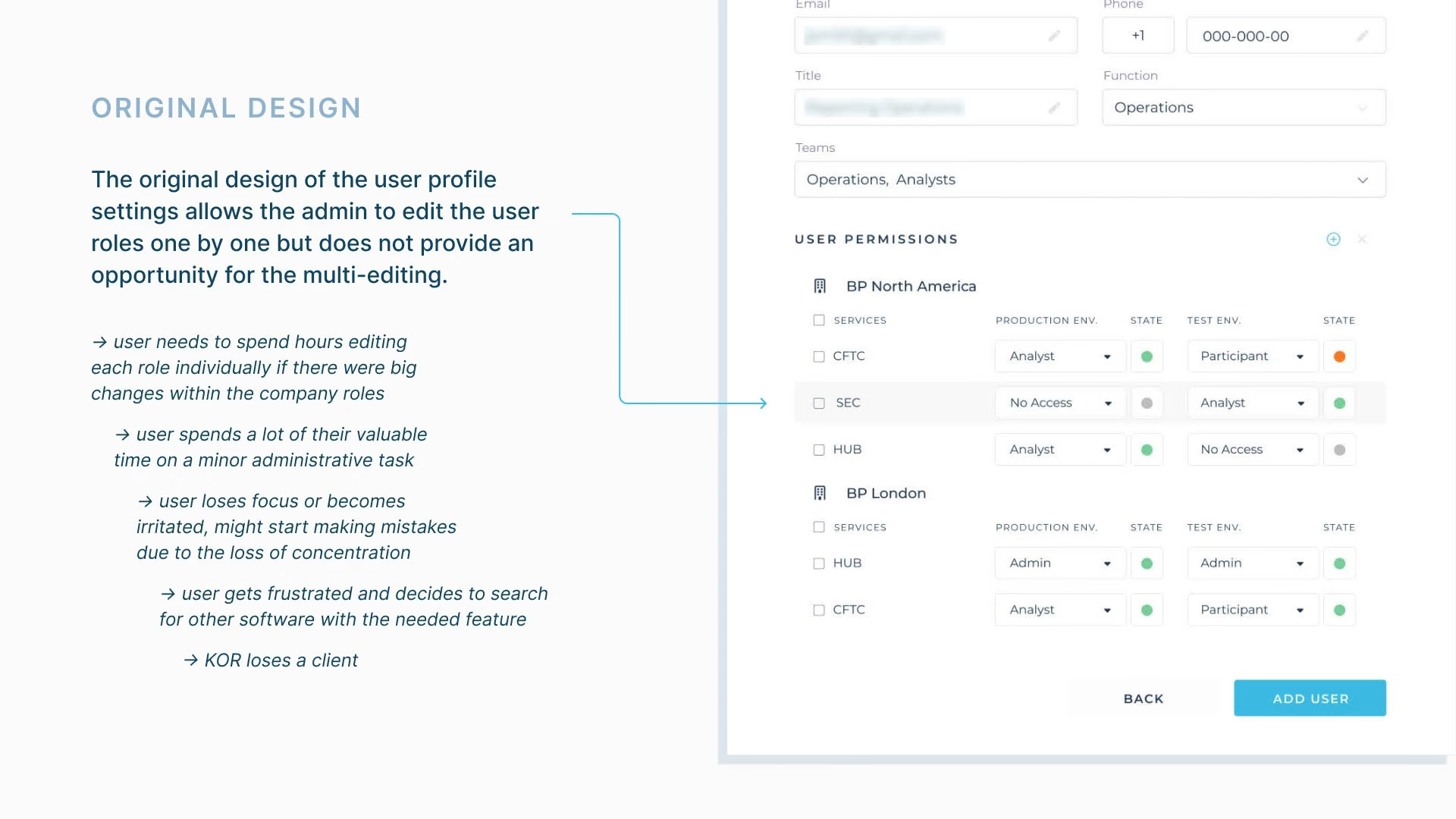
The original UI of the software without the bulk-editing feature
The original UI, without bulk editing
Industry
Fintech, B2B SaaS
Timeline
One-week sprint, February 2022
Role
Research, UX/UI design, user testing
Deliverables
Multi-edit feature: flows and prototype
Tools
Figma

02Understanding the user

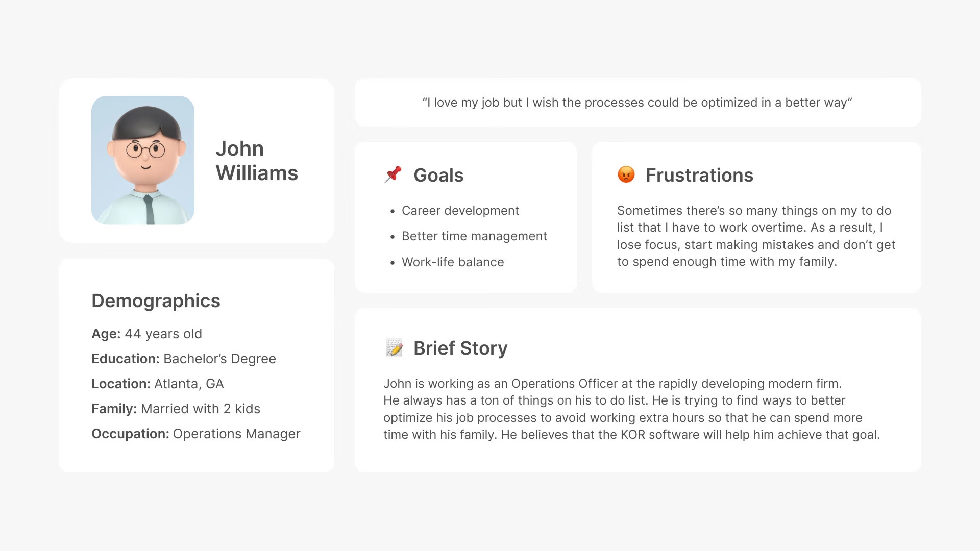
John, the operations manager

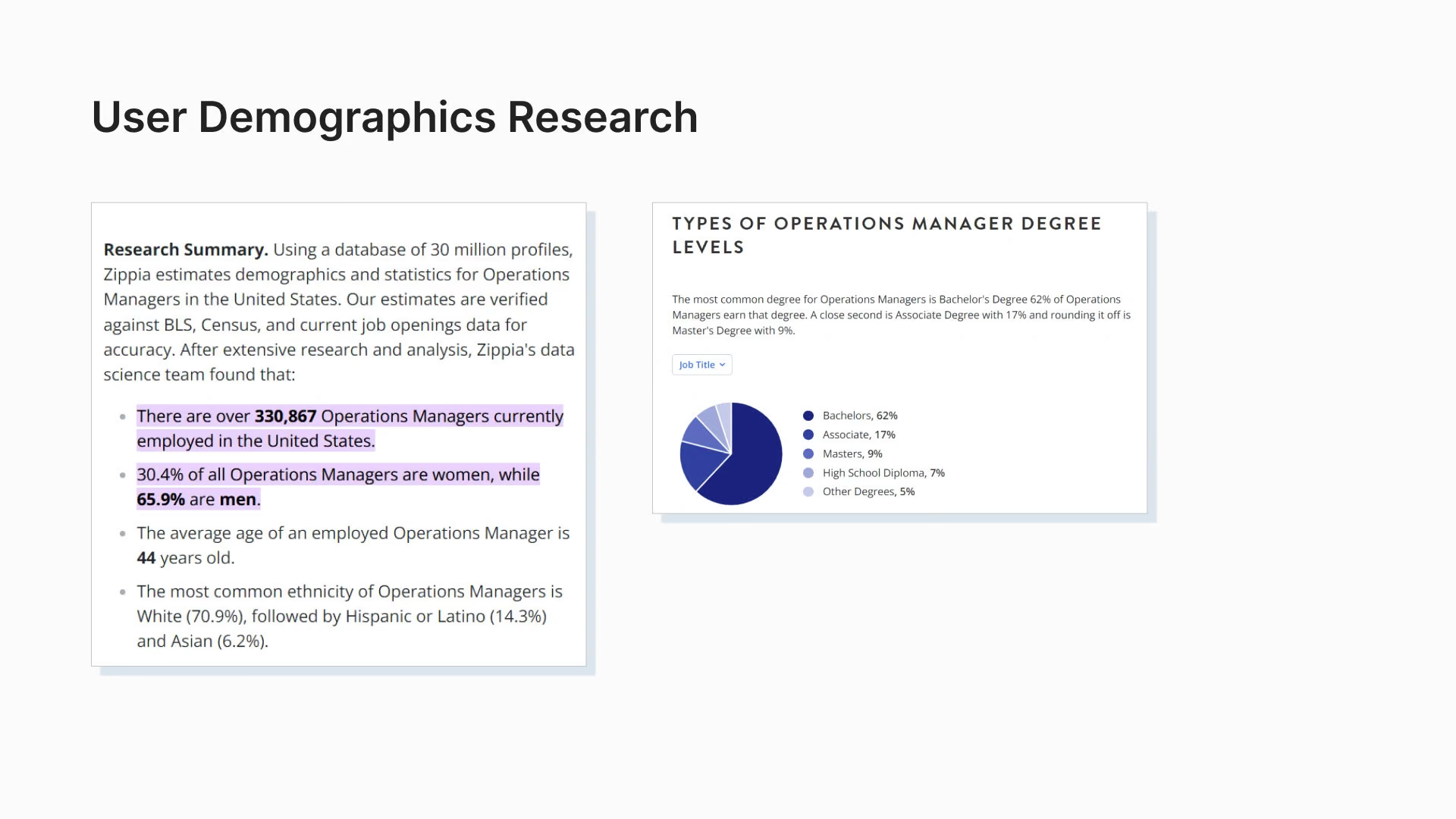
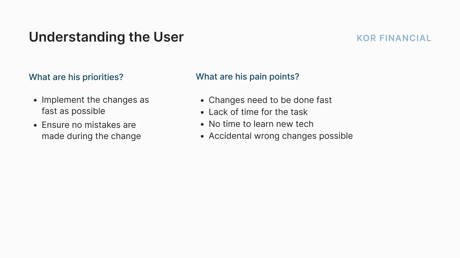
KOR had no real users to talk to yet, so I relied on secondary research and built a persona: John, an operations manager. He values speed and accuracy when changing roles. His pain points are limited time, no time to learn new tools, and the risk of changing the wrong thing by accident. The research pointed to two needed features: filtering roles by entity and service, and multi-selection.

User research
User research
User persona
User persona
User persona
User persona
User persona
User persona
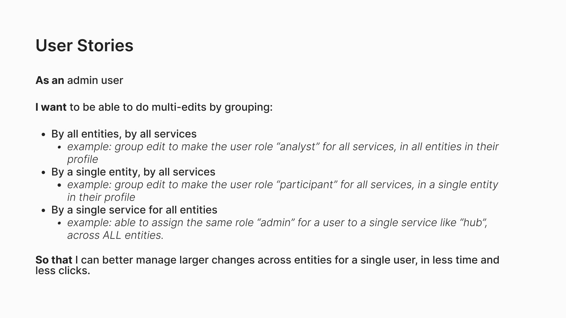
User stories
User stories
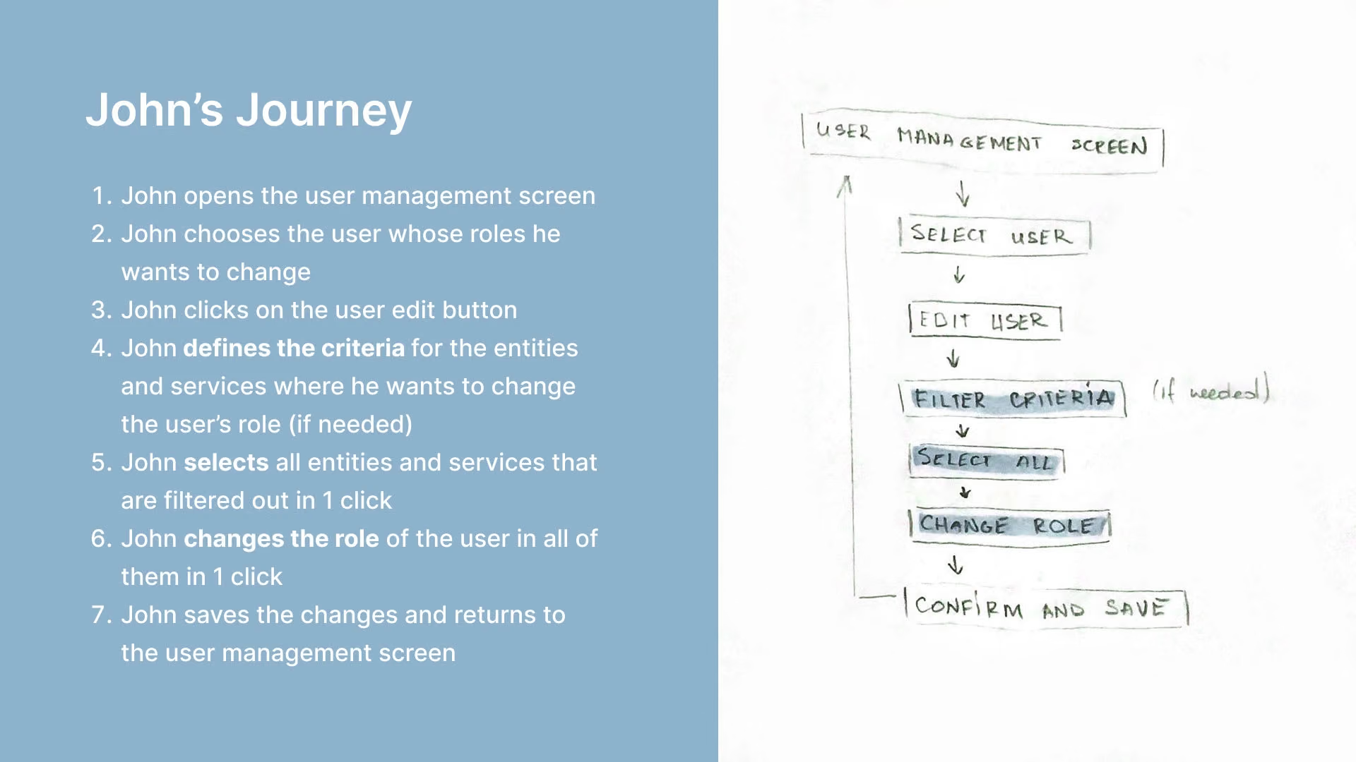
User journey
User journey

03Designing the experience

Requirements, assumptions and open questions

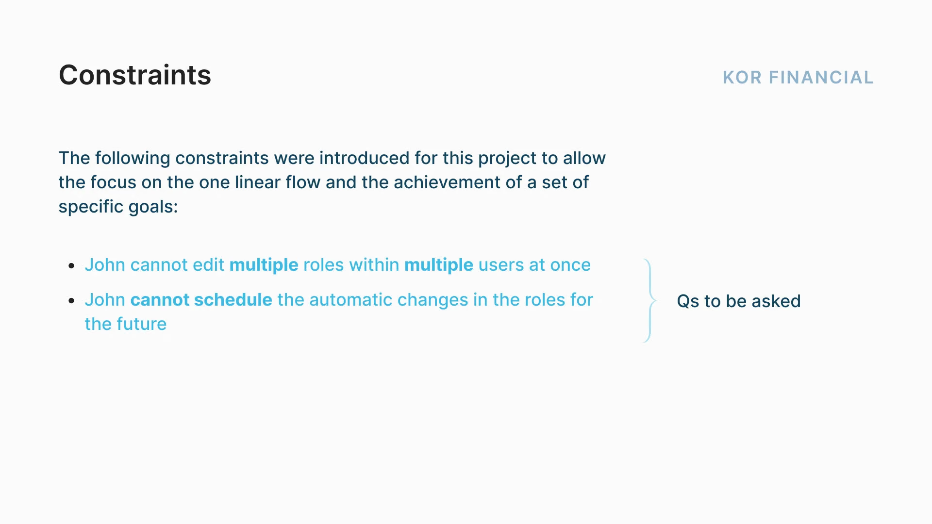
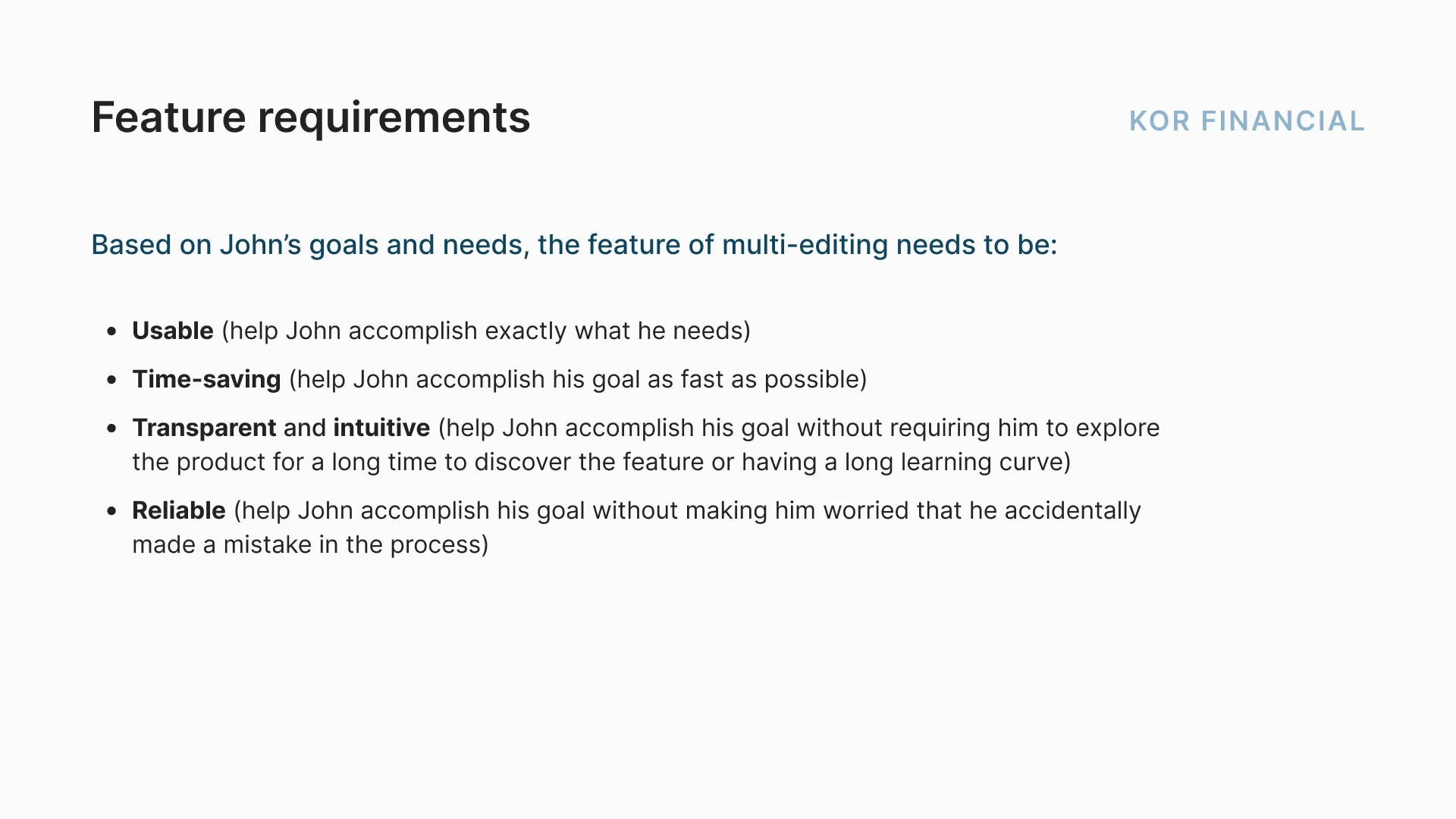
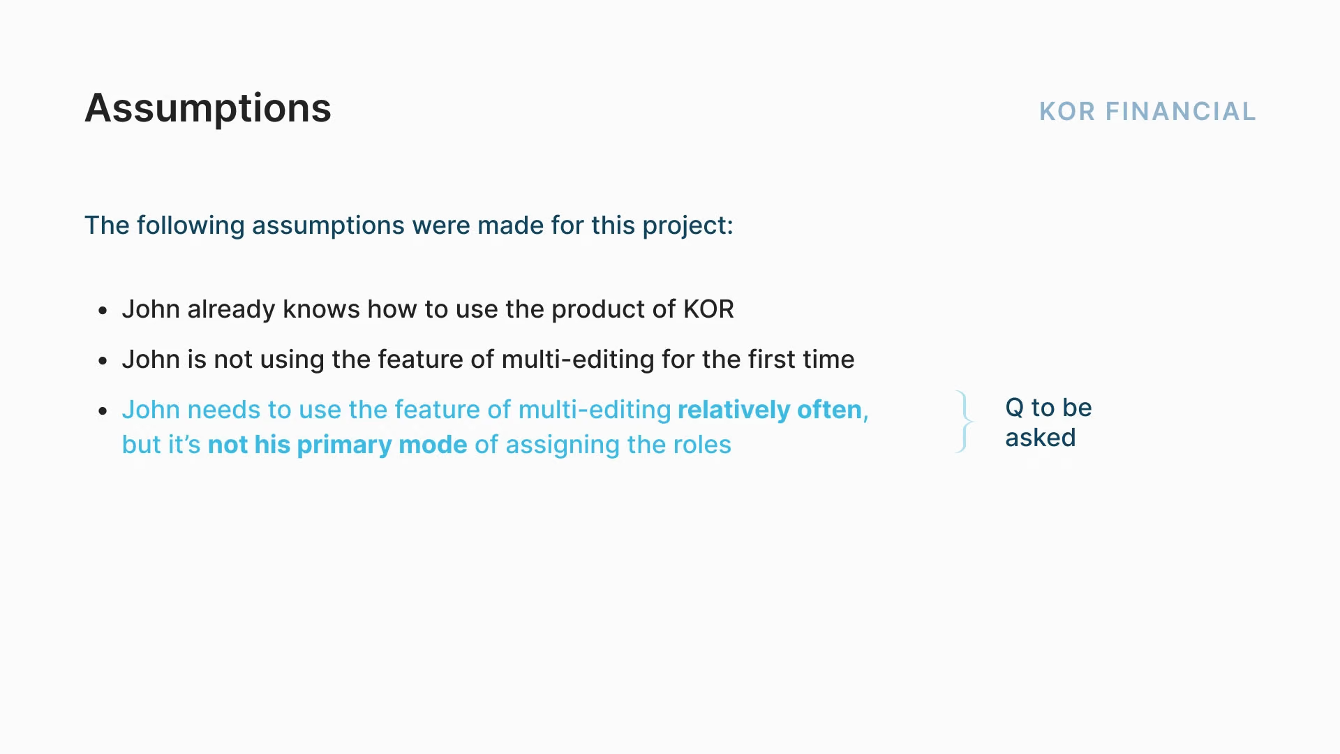
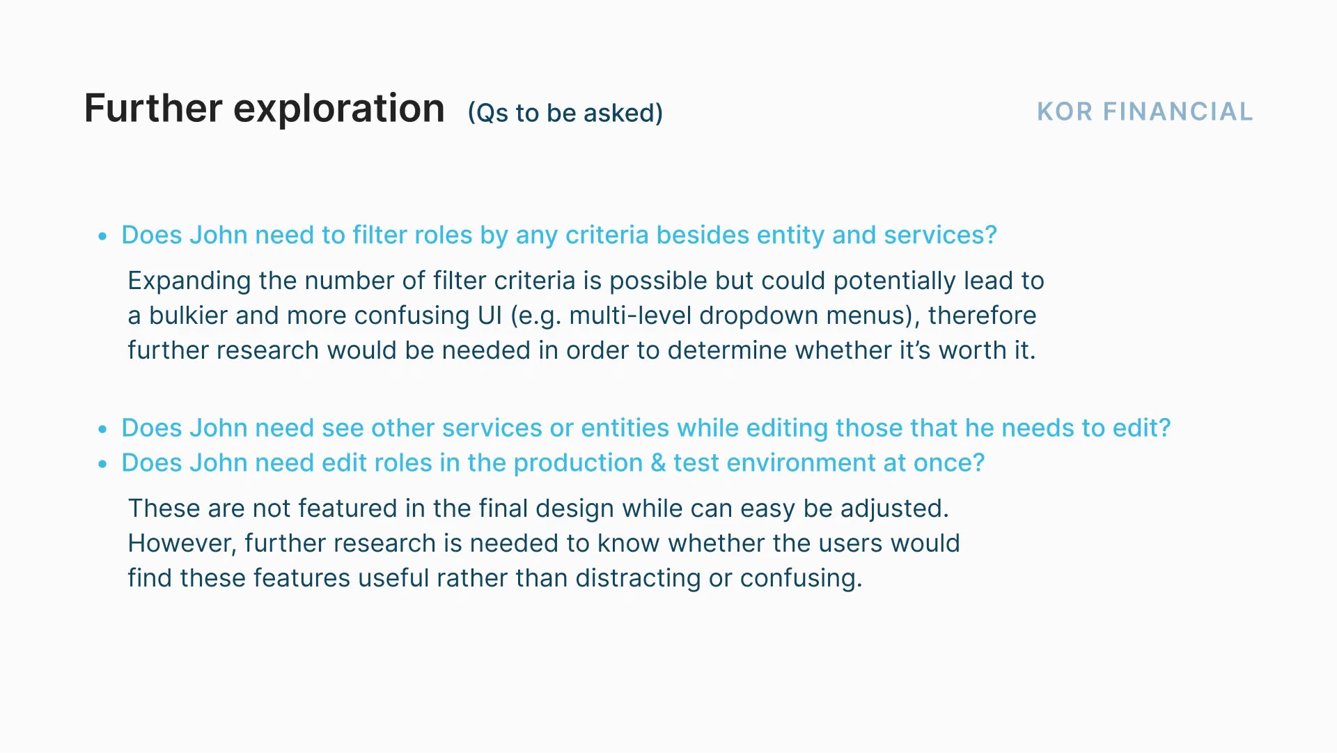
I defined the requirements, assumptions and constraints, and listed open questions to validate with users later.

Requirements and assumptions for the multi-edit feature
Constraints and open questions for the multi-edit feature
Planning the multi-edit feature

04Wireframing

Exploring on paper first

I sketched many options on paper. I dropped a global-edit concept because it would have changed the core logic of the interface and made it harder to learn. I also tested different placements and styles for the filter and select controls.

Ideating on paper
Ideating on paper

05User testing

Two prototypes, three users

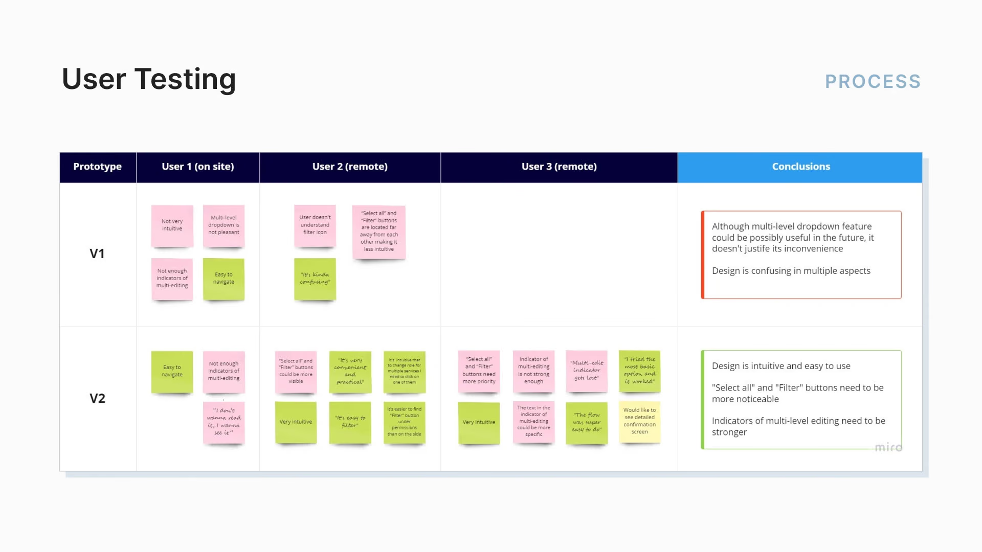
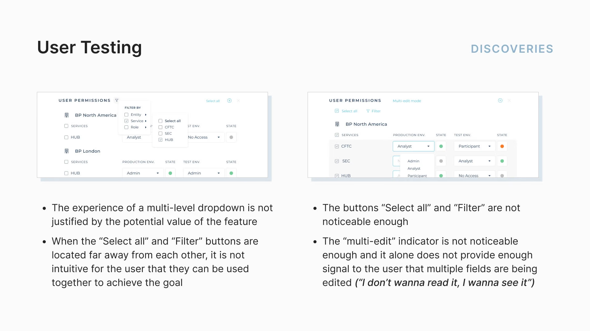
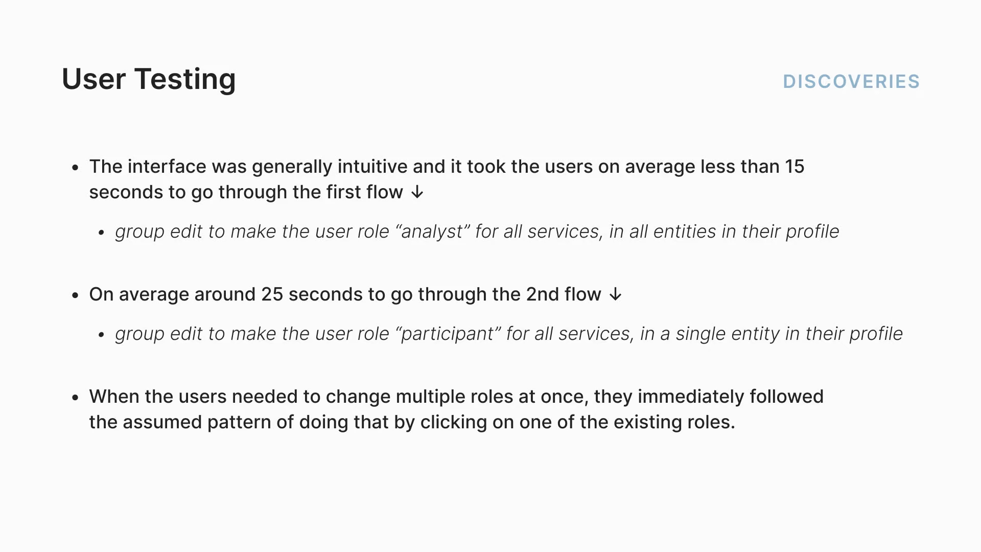
I tested high-fidelity prototypes of two designs with three users, two remote and one in person. The second performed much better. The first, a multi-level dropdown, was dropped before the third test because of time. Users wanted stronger multi-edit indicators and more visible filter and selection buttons, but they finished tasks quickly and called the interface intuitive.

User testing of the multi-edit prototypes

06Final flows

Familiar patterns, clear signals

The final design centres on multi-selection and filtering, familiar patterns that need little learning. I added three multi-edit indicators: a “Multi-edit mode” info highlight, a change of background colour, and stroke highlights on edited fields. Changes have to be saved manually, with no auto-save, so mistakes can’t slip through unnoticed. Some questions and improvements remain open.

Key solution elements of the UX/UI of the new feature
Key solution elements of the new feature
KOR Financial multi-edit final flow

07Retrospective

Fast, but also safe

The tight deadline pushed me to prototype fast. The real challenge was making multi-edit not just work but feel secure and reliable, and usability testing gave me first-hand insight into how people actually use it.

Next case study

Nomad Summit

From a website nobody touched to one that sells the tickets.

A 250-person annual conference whose website broke every time someone tried to update it, so nobody did. Six weeks later the team could change tickets, speakers and sponsors themselves, and tickets for the next edition were selling before a single speaker was announced.

Read the case study

Tell me what you’re building.

A brand that needs to catch up, a website, a pitch deck. Write a few lines about where you are and what you need, and I’ll reply personally.

New messageDraft
ToAlexandra

Hi Alexandra,