A landing page redesign for a healthcare company.

A UX and UI redesign of a B2B healthcare landing page: the key value points above the fold, a clear way to get in touch, and trust built in.

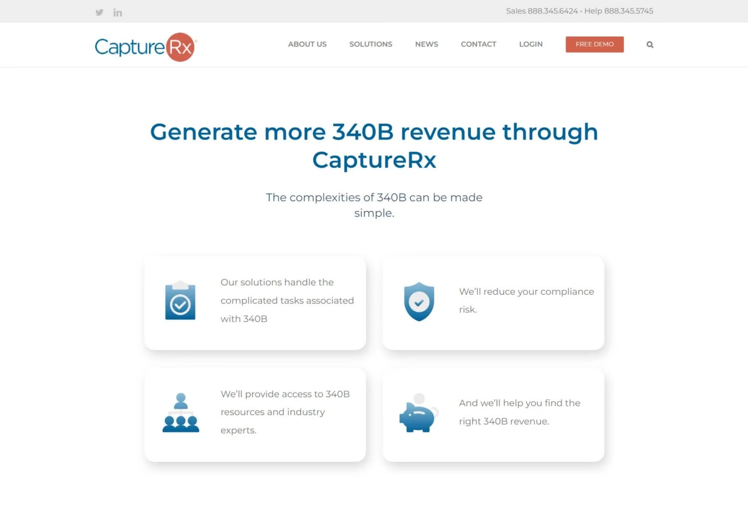
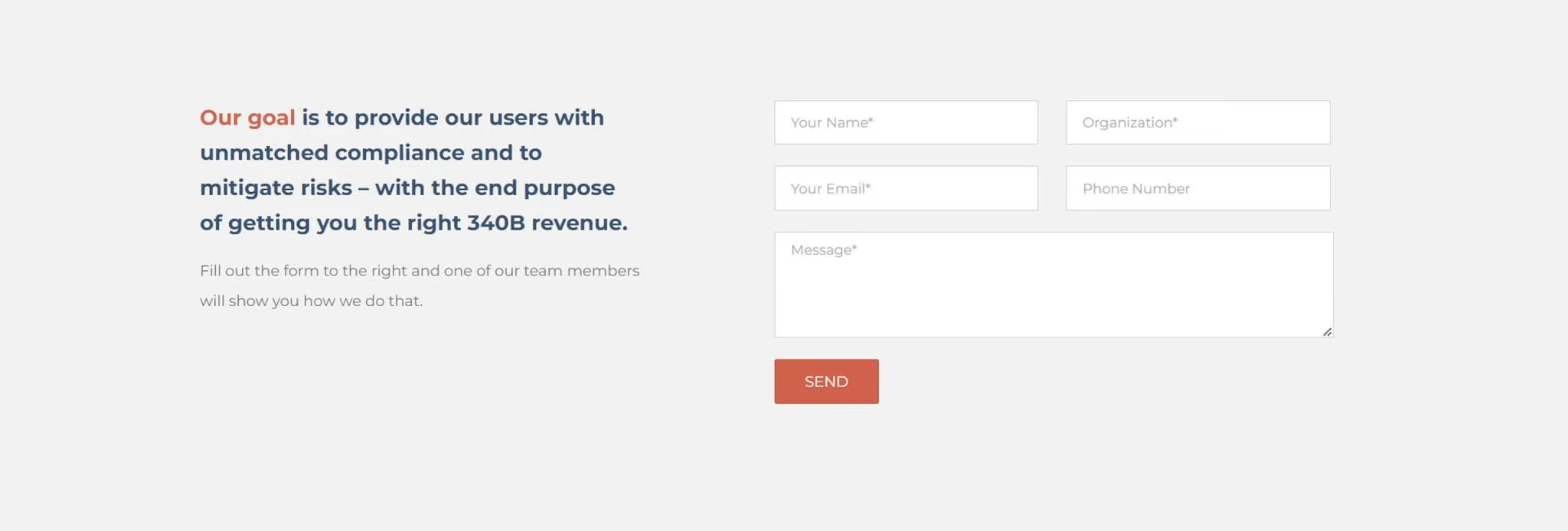
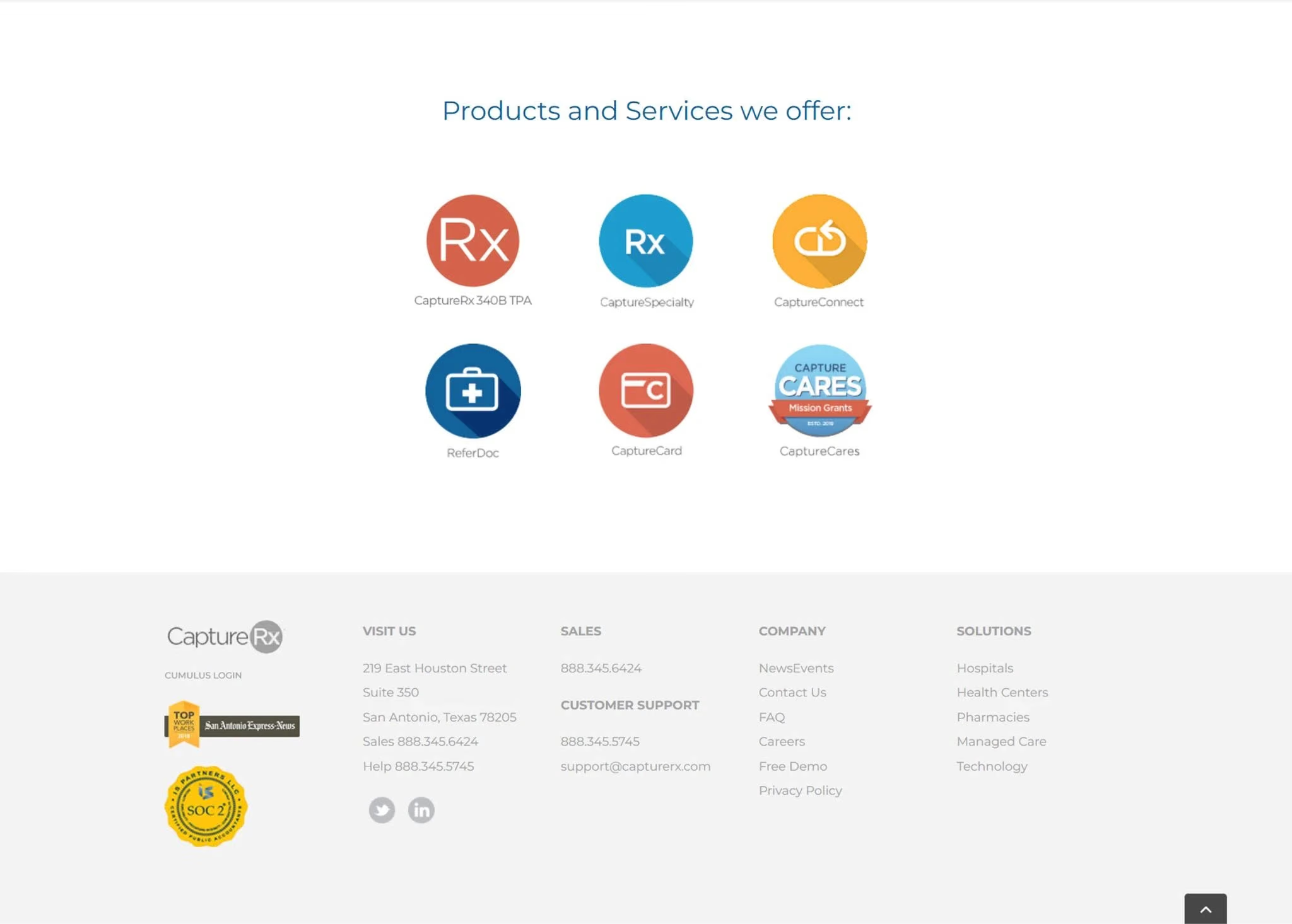
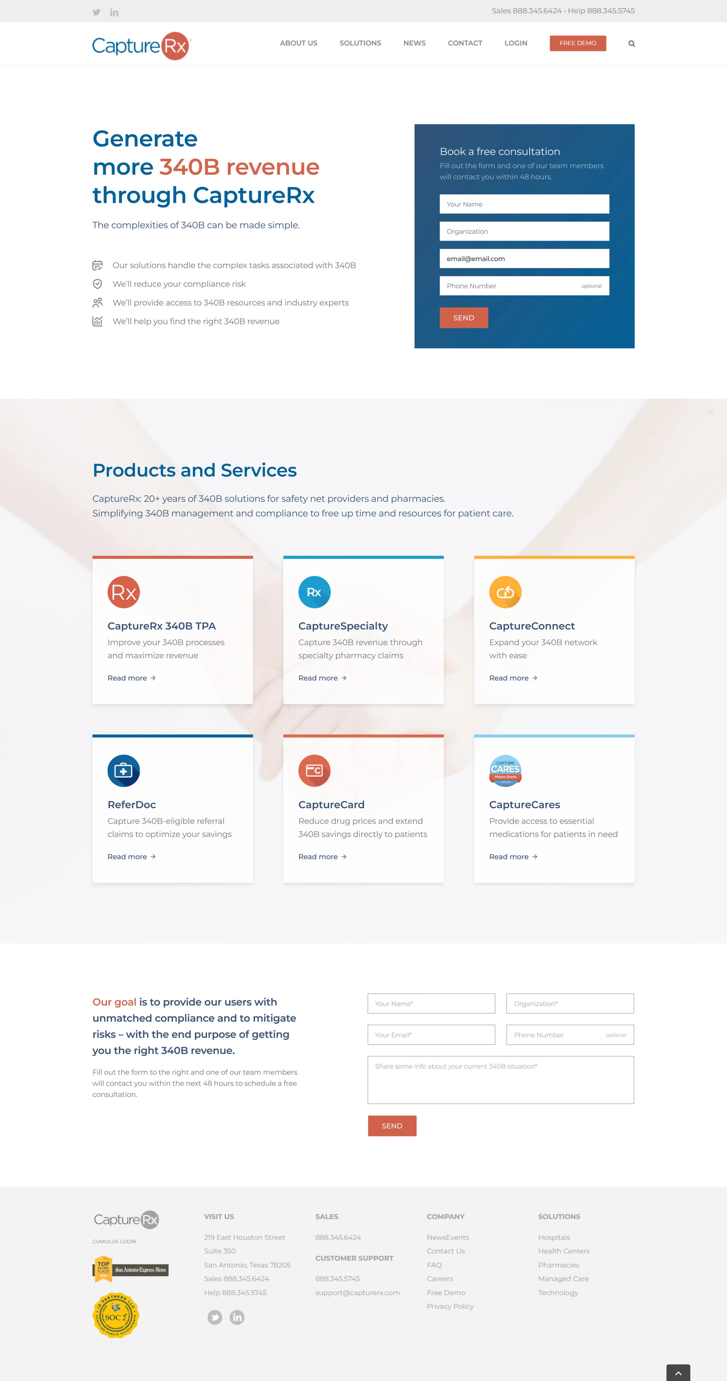
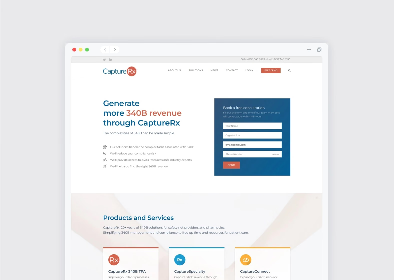
CaptureRx landing page, original design and new design
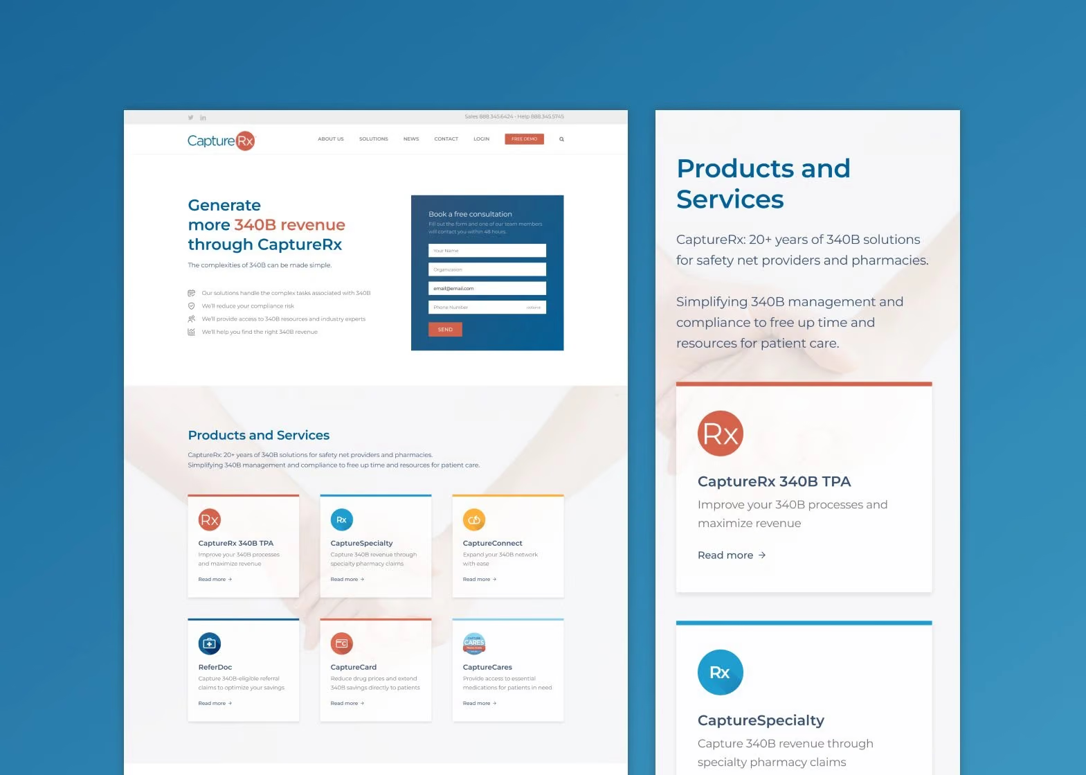
New CaptureRx landing page, desktop and mobile
New CaptureRx design

01Overview

Better UX within a fixed brand

CaptureRx helps eligible healthcare organisations get discounted prescription drugs through the 340B programme. In May 2026 it was acquired by Pillr Health. I redesigned its landing page to improve the experience and the visual design, while keeping the existing brand identity and copy.
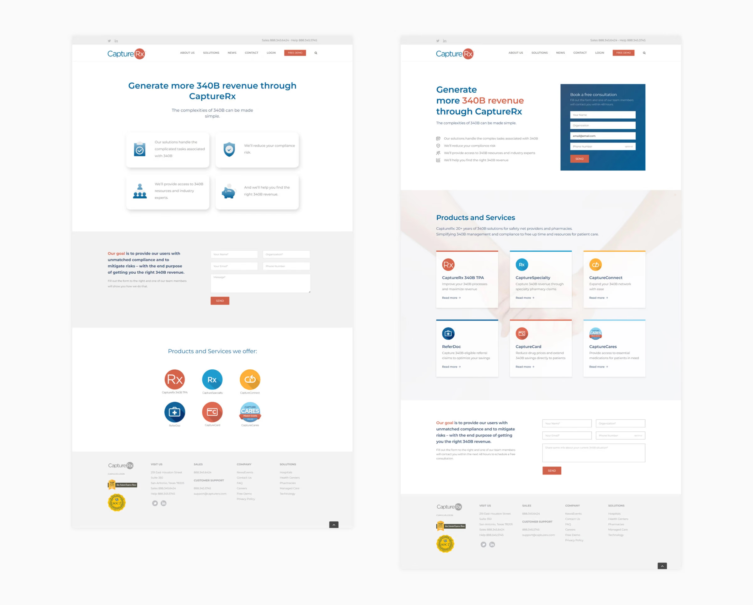
CaptureRx landing page, original design and new design
Original design to new design
Industry
B2B healthcare (340B services)
Timeline
February 2023
Role
UX/UI designer
Deliverables
Redesigned landing page, desktop and mobile
Tools
Figma, Adobe Photoshop

02Analysis

Where the old page lost people

The hero didn’t show the key value points above the fold and had no clear way to get in touch. Centred text with hanging words and loose line spacing was hard to scan, the heavy 3D effect on the value cards didn’t match the rest of the site, and large ornate icons drew attention away from the value proposition.

The form gave no timeline and a vague follow-up statement, its message field didn’t say what to write, and low contrast made it hard to spot. The products were a bare list, and the individual product pages were text-heavy. Some items were links, but nothing showed it.

Overall, the page lacked an emotional connection and the trust and reassurance the brand calls for. It had no company information such as value proposition, experience or social proof, and too much empty space made it dull.

Section 1 of the page, original design
Section 2 of the page, original design
Section 3 of the page, original design

03Redesign

Clearer, warmer, easier to act on

The hero now shows all the key value points above the fold, with a contact form on the right as a clear call to action. Minimal icons guide the eye without competing with the text. The form explains the timeline and what the user gets after submitting, and a bright blue accent makes it stand out.

Products and services are in an easy-to-scan layout with a short description each and clear link indicators. Photography adds trust and reassurance, and a short company description establishes experience and background. A second form at the end serves visitors who want to book a consultation after reading, with a better description and suggestions for what to write in the message field.

New CaptureRx design
Redesigned CaptureRx landing page

04Retrospective

Refinement over reinvention

I valued the chance to focus purely on UX and UI with the branding and messaging fixed. The original design was already reasonable, so the gains came from refinement.

Next case study

Rebesana

A longevity brand with a website as considered as its science.

A homepage, product page and landing page for a longevity startup, with custom imagery throughout. I worked with the founders, marketing and copy, and stayed on through development so the build matched the Figma.

Read the case study

Tell me what you’re building.

A brand that needs to catch up, a website, a pitch deck. Write a few lines about where you are and what you need, and I’ll reply personally.

New messageDraft
ToAlexandra

Hi Alexandra,