A brand and website redesign to win partners and customers online.

Two years of continuous UX and UI work, a new visual language and a design system for a B2B e-commerce SaaS startup that was acquired in 2022.

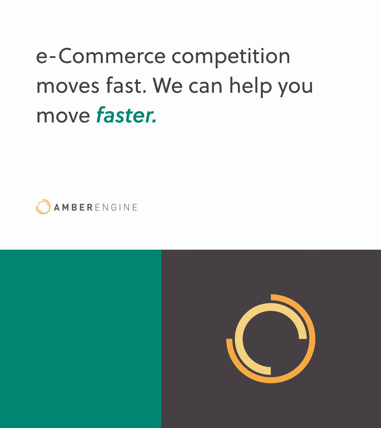
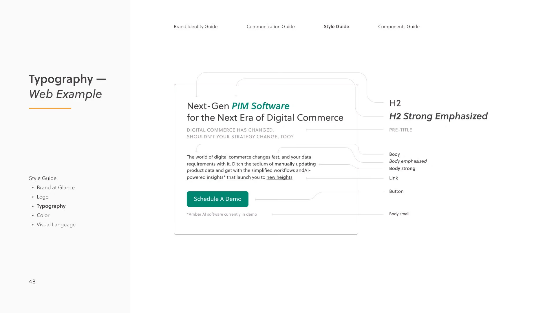
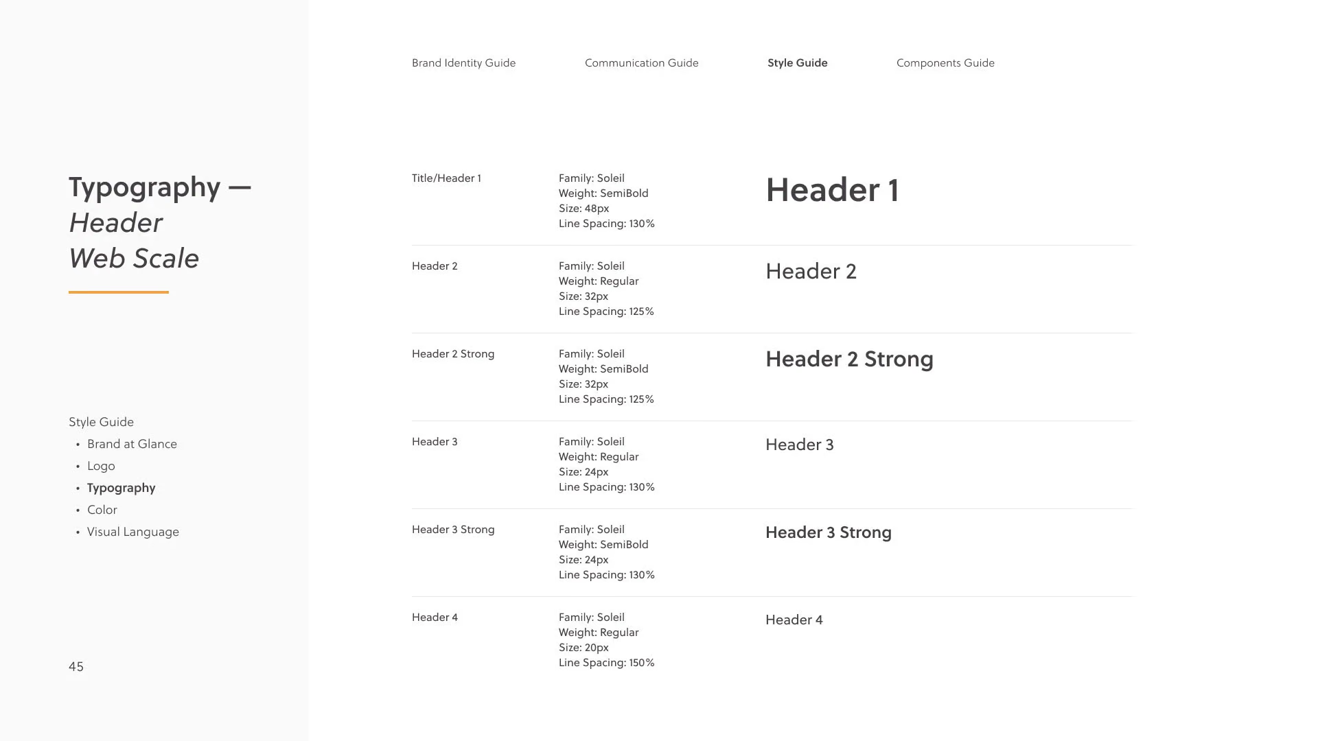
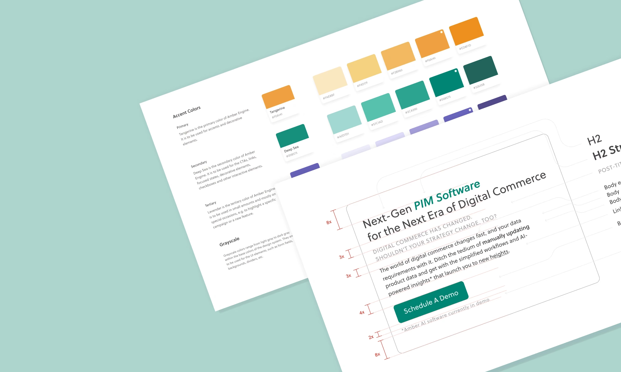
Amber Engine colour palette and typography
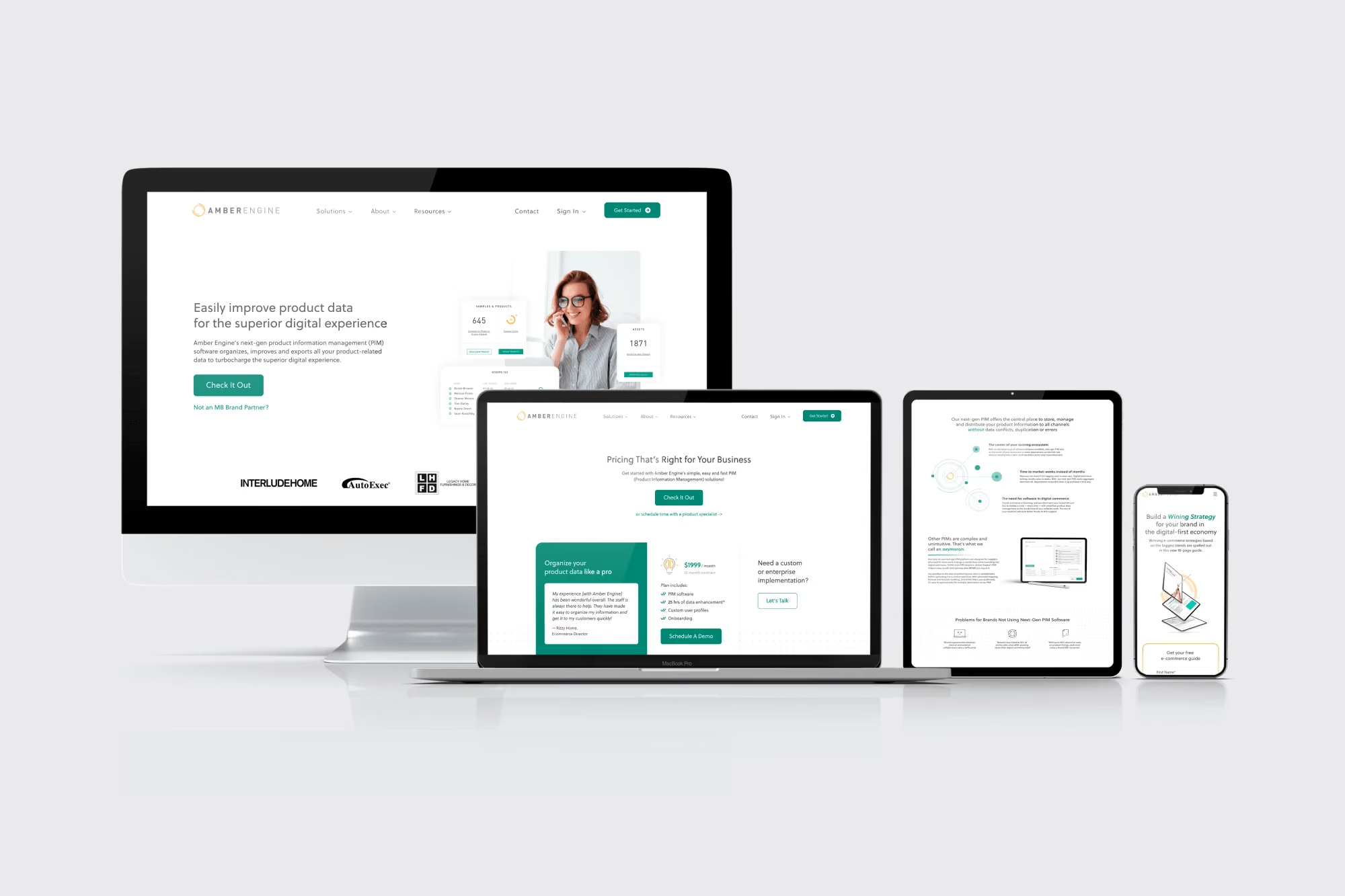
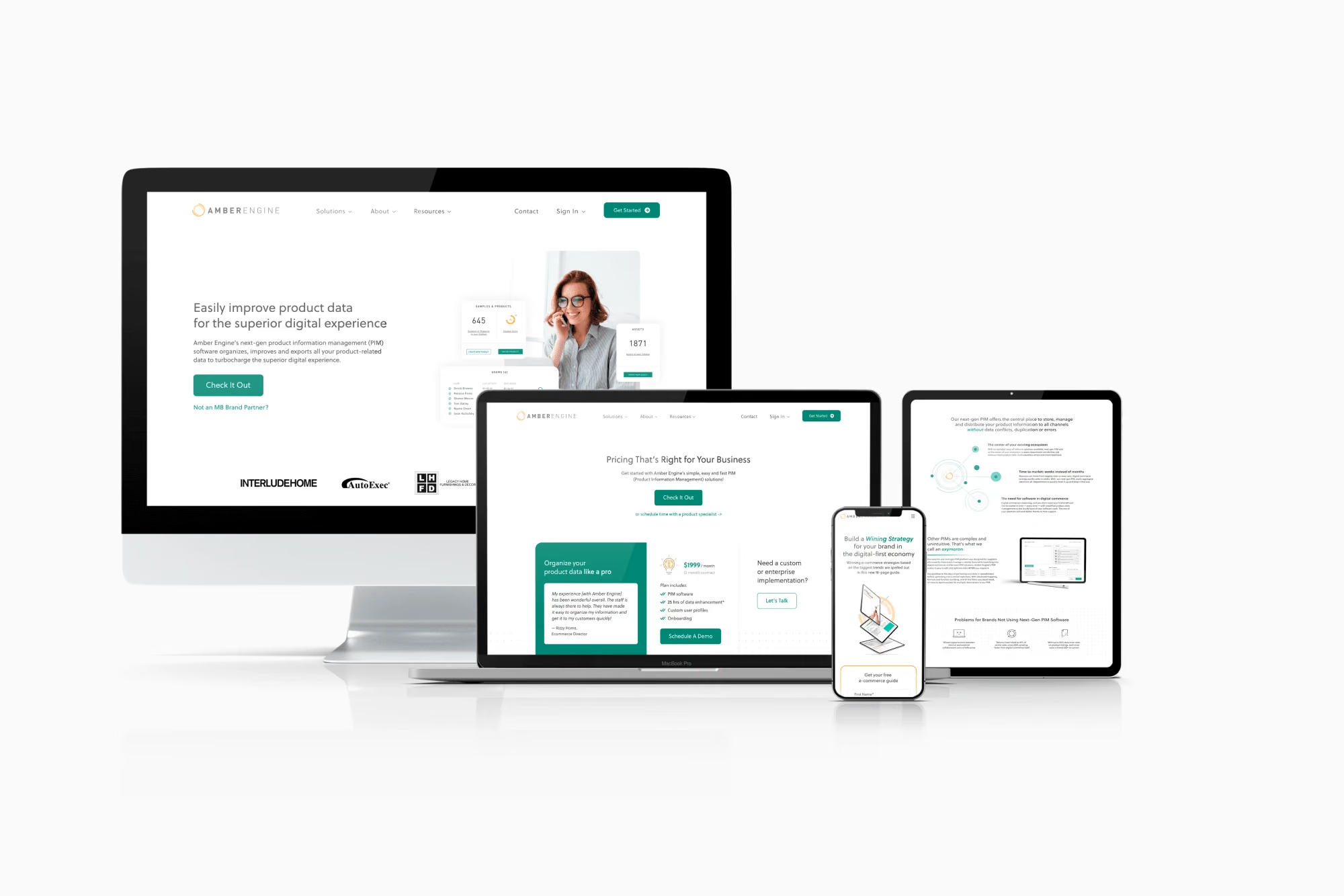
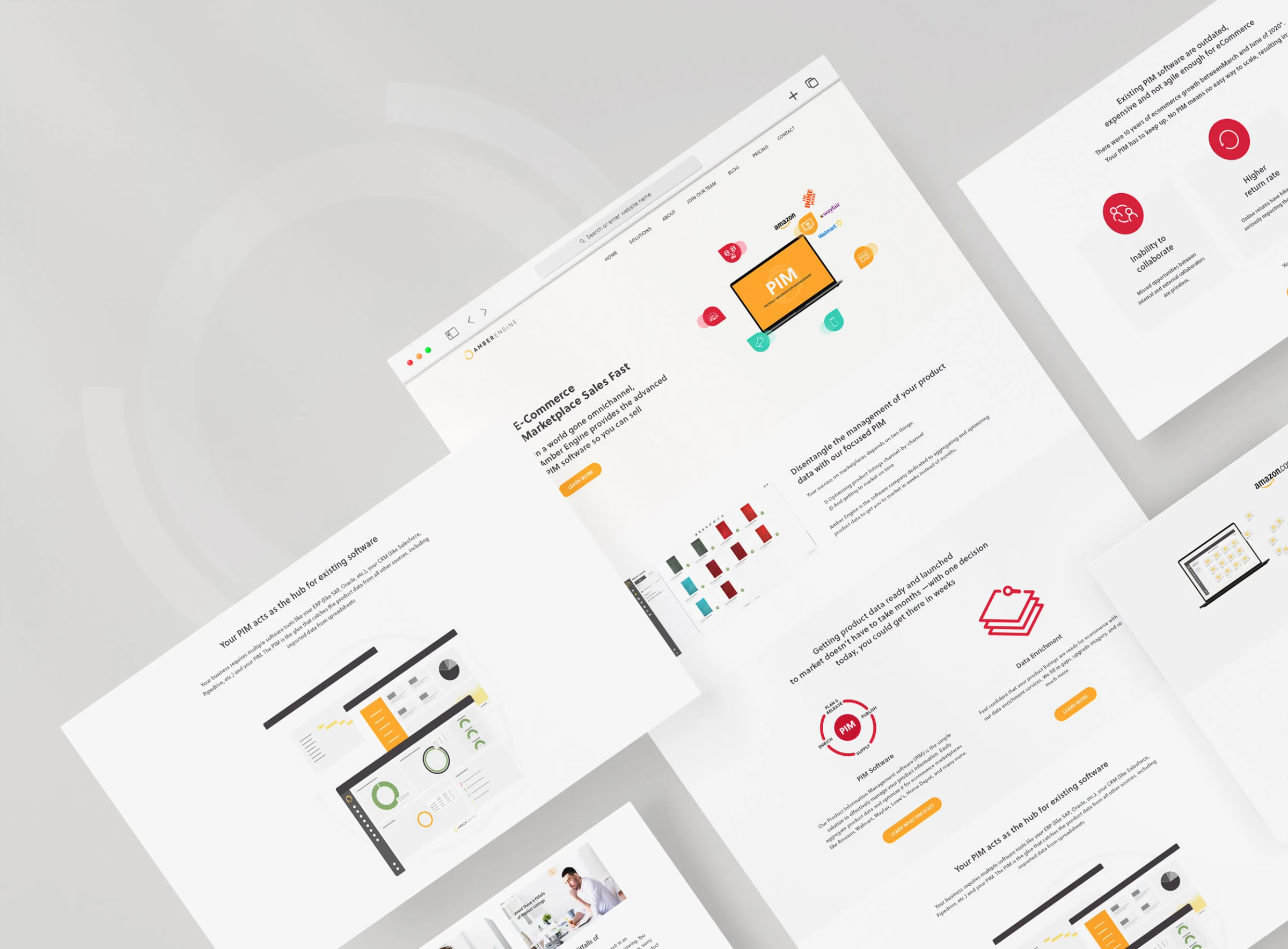
New Amber Engine website
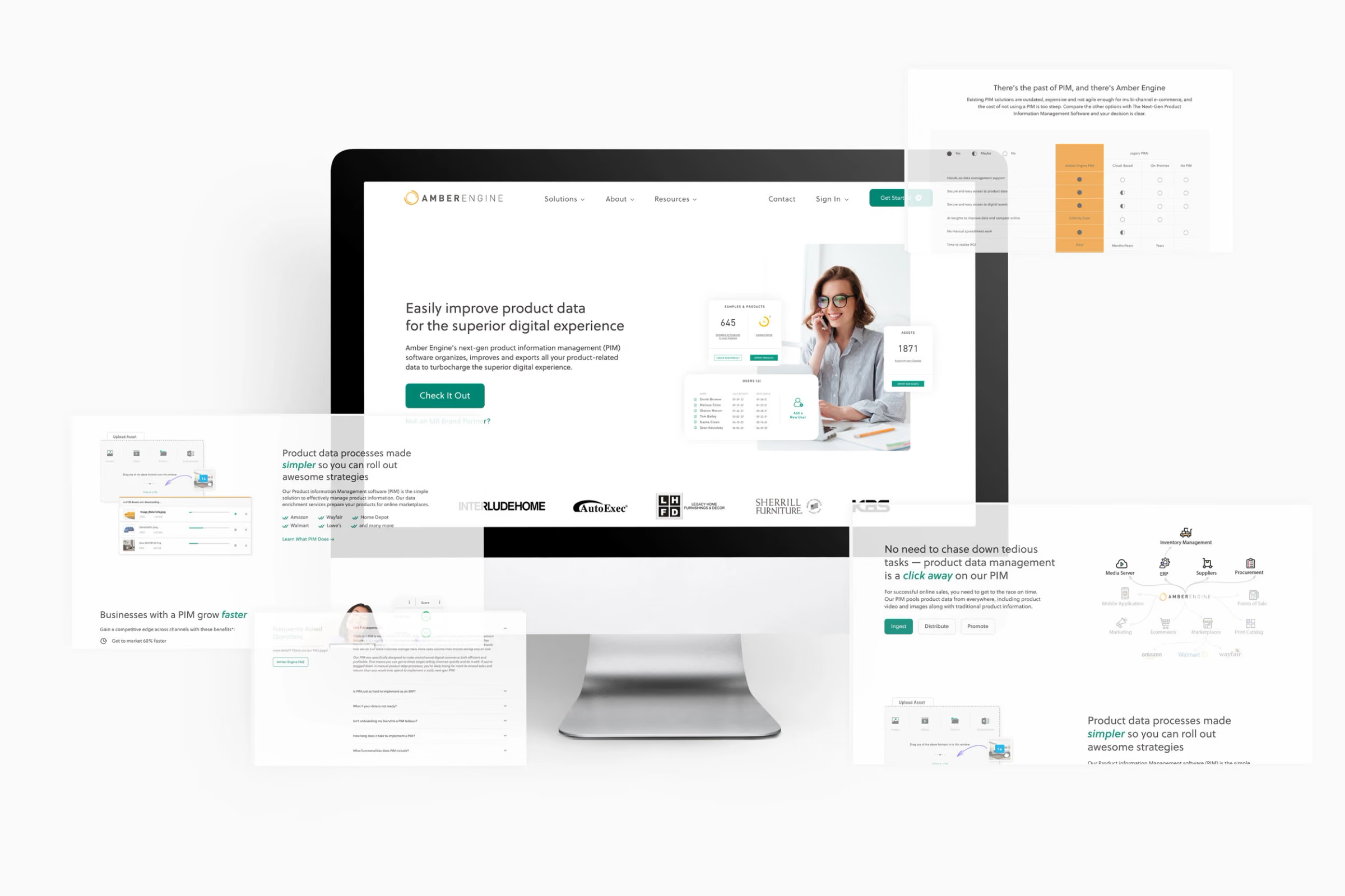
New Amber Engine homepage
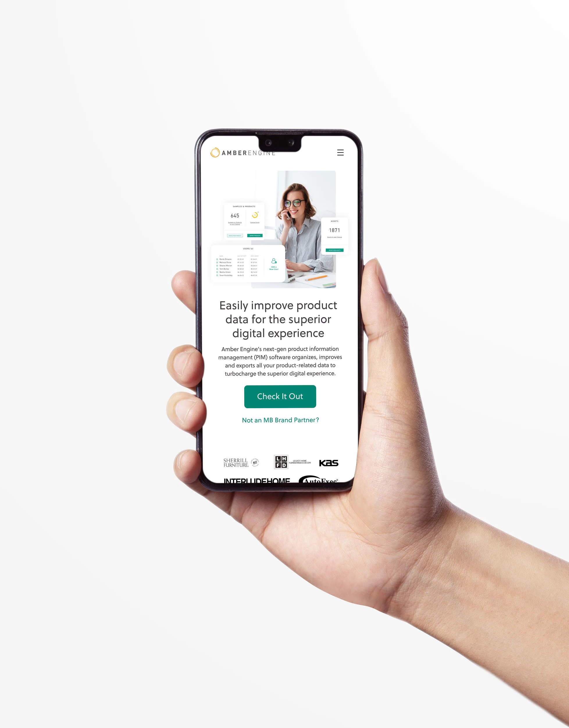
New Amber Engine homepage on mobile
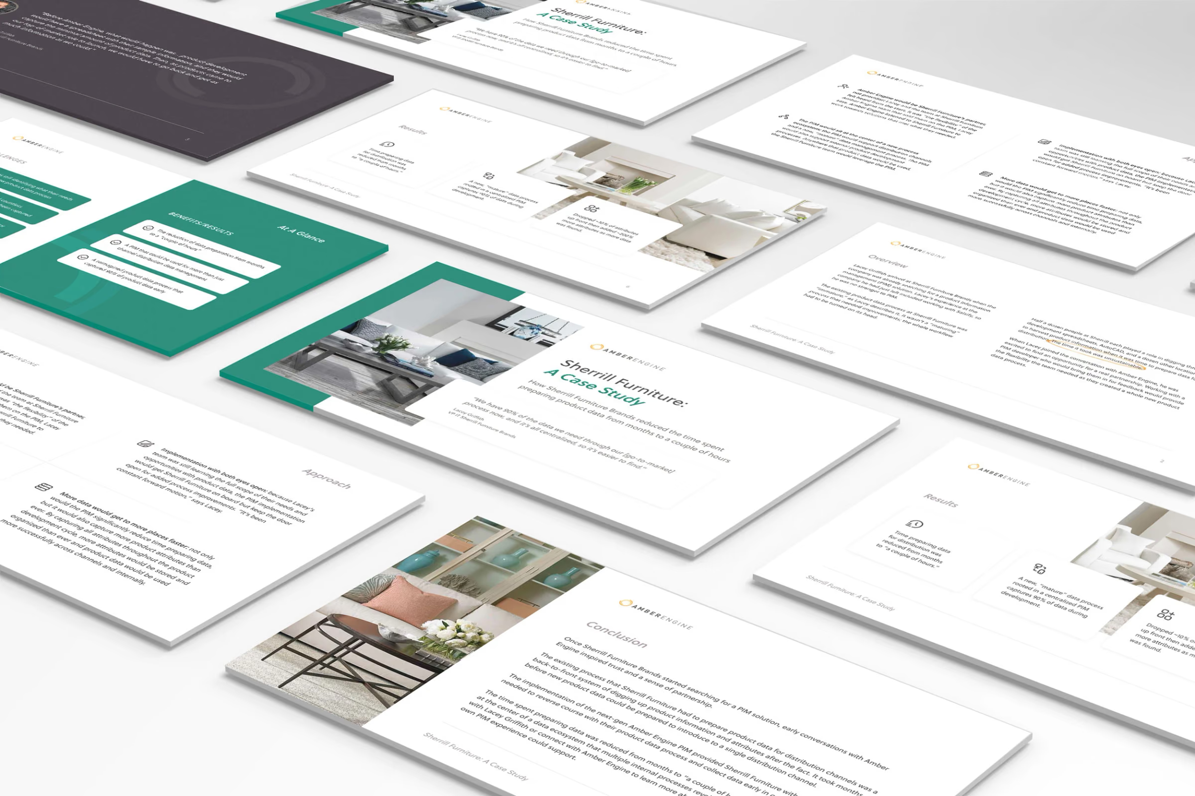
Case study presentation for Amber Engine

01Overview

A website that had to catch up with the product

Amber Engine is a B2B e-commerce SaaS startup. Its product was strong, but its website was always a work in progress, with some projects big redesigns and others small adjustments.

The website made the company look less credible, which cost it some partnership opportunities and brought in few customers from online channels. The goals were to update the brand look to match the quality of the product, design a professional and credible UI to attract customers, and improve the UX so visitors could easily learn about the company and its product.

Industry
B2B e-commerce SaaS
Timeline
April 2021 to July 2023
Role
Lead UX/UI designer, visual language, design system
Deliverables
Website redesign, brand update, design system, campaign assets
Tools
Figma, Adobe Illustrator, Adobe Photoshop
02Process

One design owner on an agile, remote team

I was the main design owner on an agile, fully remote, international cross-functional team. Changes ranged from button styles to forms, navigation structure and pop-up settings. Most followed the same path:

  • Ideation, open to anyone on the team
  • Discussion and roadmap prioritisation
  • Research, using competitor reviews, heatmaps or analytics
  • First design on the canvas
  • Presenting the draft with a video walkthrough
  • Approval or iteration
  • Development
  • Testing and further iteration

03Original site

What the old website was doing wrong

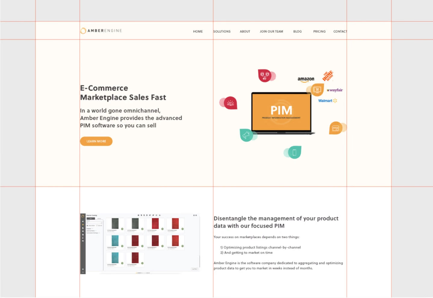
The original site was clean and minimal, with generous white space and a clear grid. But it had problems:

  • Too much empty space and flat backgrounds made it feel sparse
  • Few product visuals, mostly sketched illustrations, even though an easy-to-use interface was a key selling point
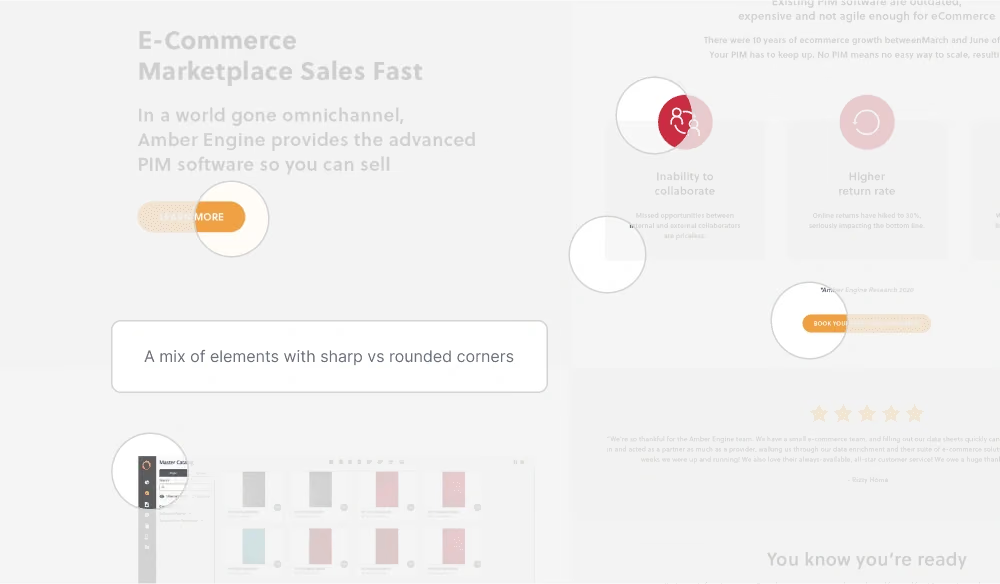
  • Inconsistent elements, such as mixed corner radii and different colours for the same call to action
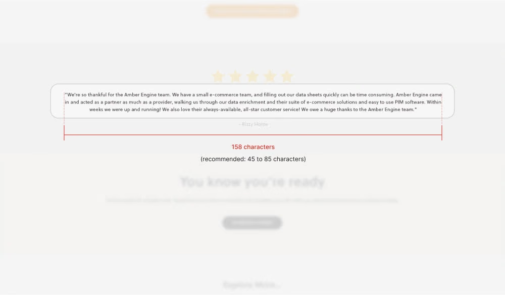
  • Some lines of text too long to read comfortably
  • Little human or emotional presence
  • Red accents that felt like error warnings
  • A blog that looked disconnected from the rest of the site
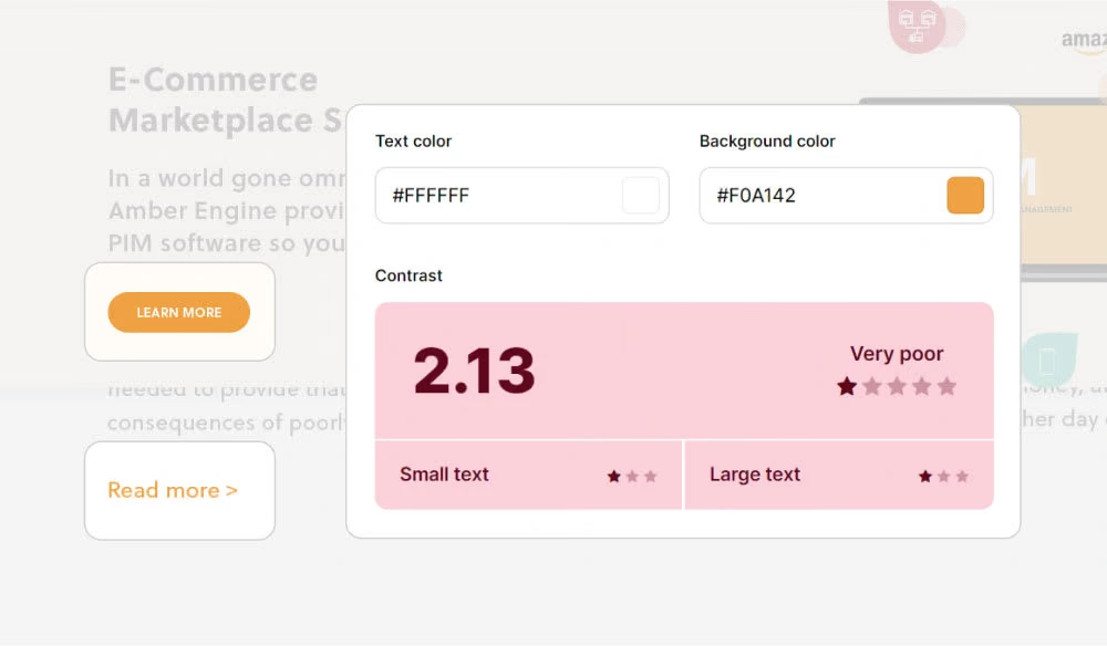
  • Some colour combinations that failed accessibility standards

Each could be fixed on its own, but the goal was a complete new brand look.

Original UI of the Amber Engine website
Original UI grids
Original colour contrast
UX/UI issues on the old website

04Redesign

A softer, more credible look

The visual direction moved back and forth between minimal and playful. I also pushed for better UX, for accessibility (palette changes, alt text, tag checks) and for a design system to keep everything consistent. Three principles guided the redesign:

  • Audience: mostly C-level executives who visit the site as an information step before buying, so the design had to be concise, minimal, professional and trustworthy
  • Softness: rounded elements echo the circular logo and support the idea that soft shapes build trust
  • Accent colours: bright accents express the brand values of being easy and fun to use
Amber Engine redesign exploration

05UX

Making the site easier to understand

Alongside the visuals, the UX work covered:

  • Clearer, more concise navigation
  • Pricing and key details, such as trial length, that are easier to find
  • Case studies that show how the company helps its clients
  • Internal materials to help the team and stakeholders present the company
  • Removing an intrusive lead-generation pop-up
  • Explaining what to expect during onboarding
  • Showing the product UI early
  • Clarifying how each Amber Engine product differs
  • Better site search

06Other materials

Beyond the website

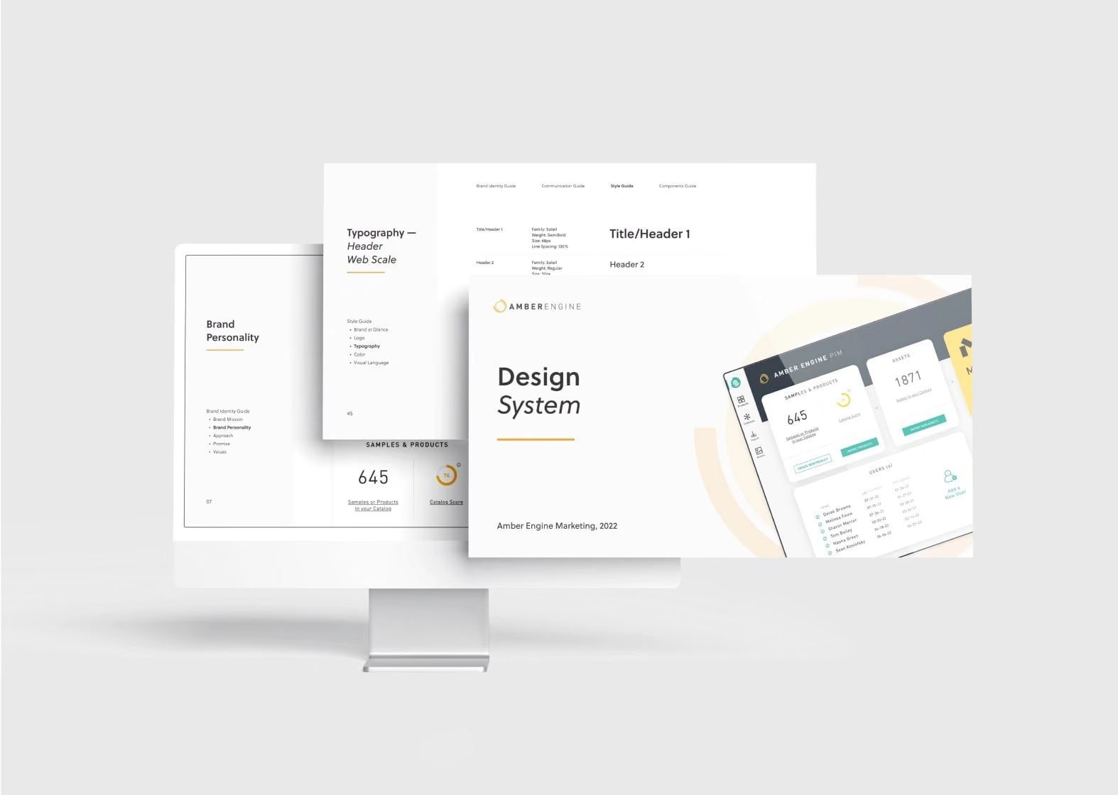
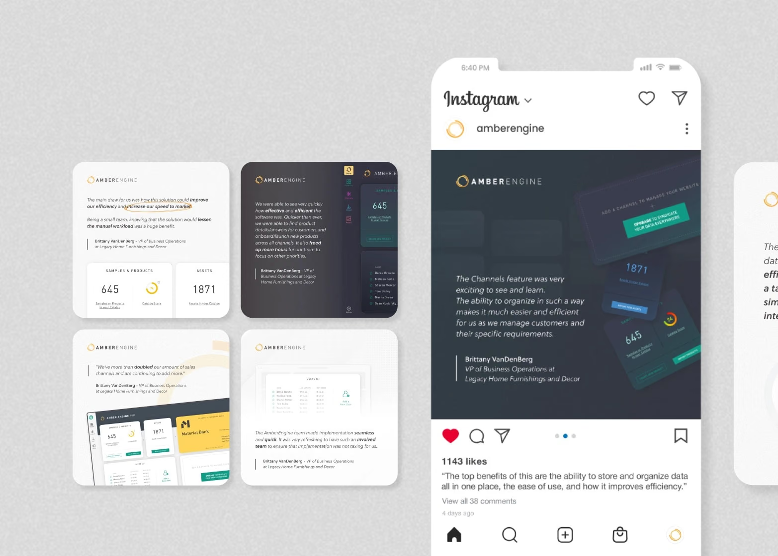
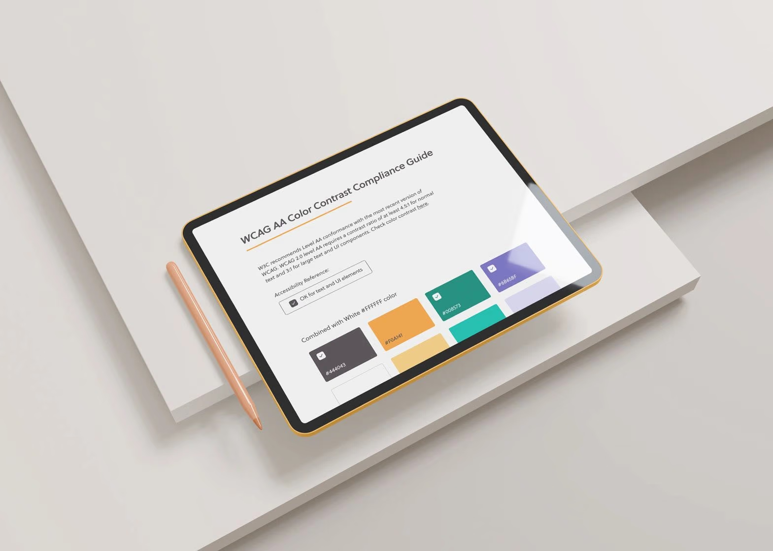
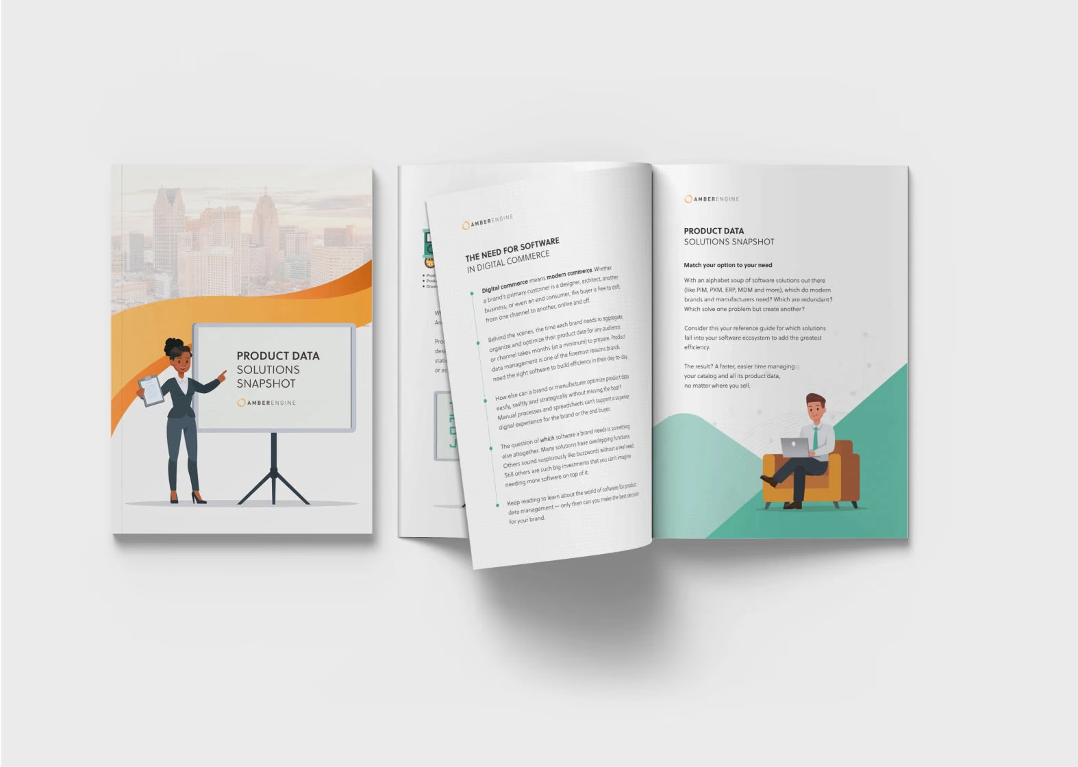
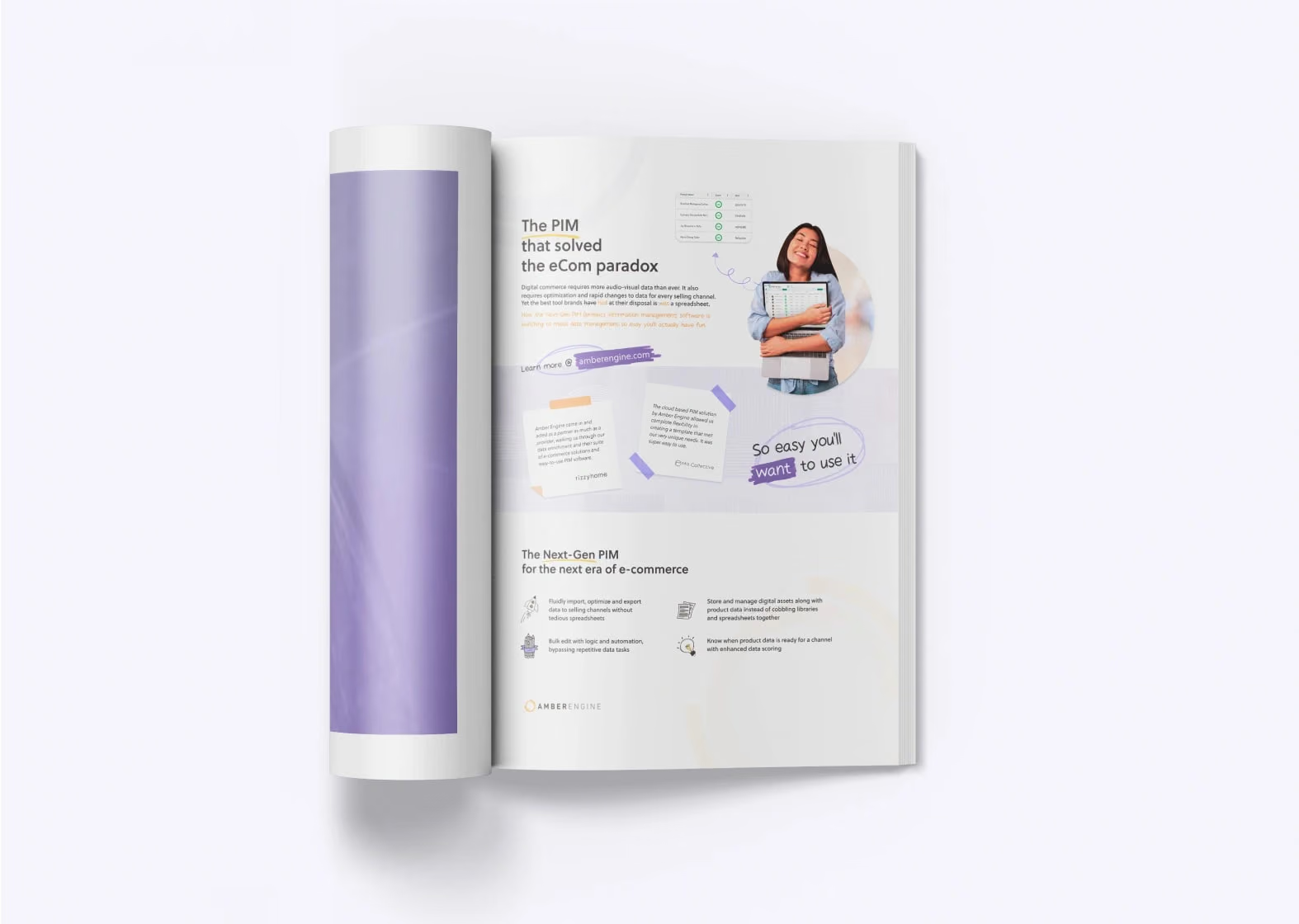
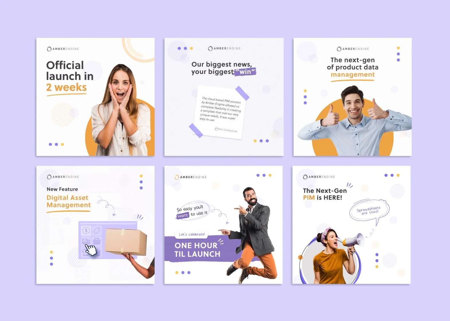
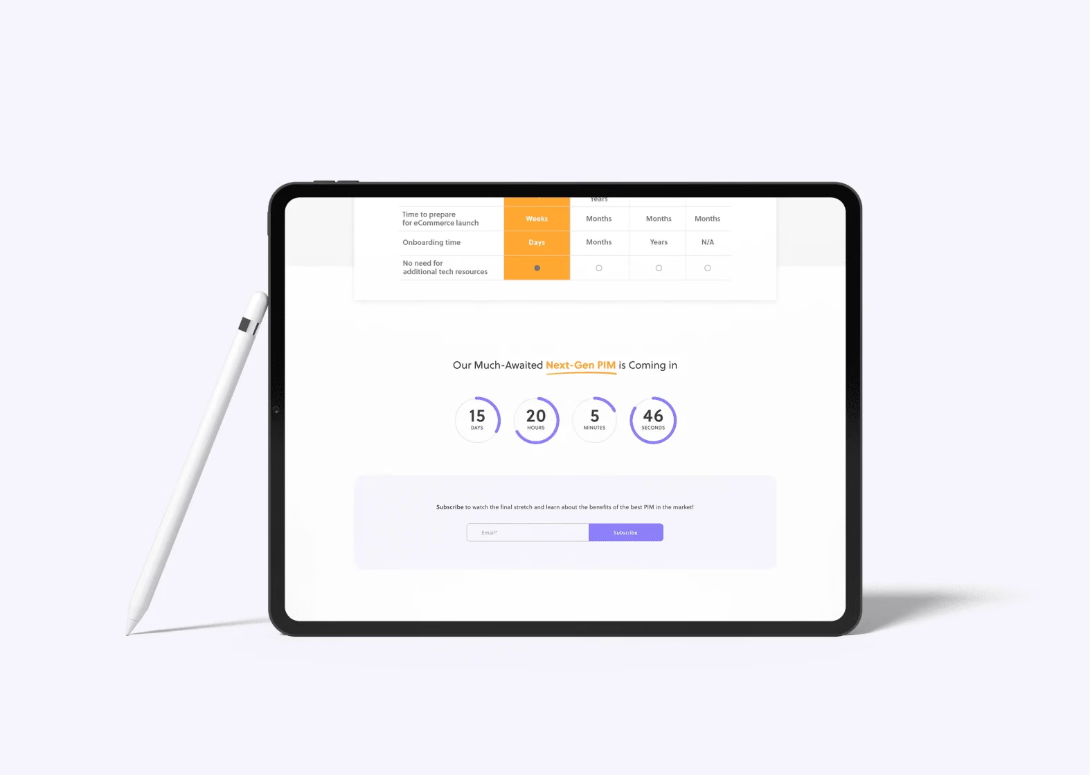
I also made a design system, a case study presentation, social media graphics, a WCAG colour contrast compliance guide and a brochure. I was creative director on the launch campaign, a purple-led mix of a magazine ad, social graphics and a launch countdown.

Design system for Amber Engine
Case study presentation for Amber Engine
Social media graphics for Amber Engine
WCAG colour contrast compliance guide for Amber Engine
Amber Engine brochure
Amber Engine magazine ad
Amber Engine social media graphics
Amber Engine launch countdown

07Results

What it led to

The more professional look helped Amber Engine land more corporate partnerships, and the first customers came from its online presence and marketing. The company was acquired by Material Bank in March 2022, alongside other product and marketing efforts.

08Retrospective

Continuous improvement, not a one-off redesign

This was one of my longest and most complex projects. I learned about teamwork and cross-functional communication, mentored junior designers for the first time, and saw how much it matters for designers and developers to work closely together. The work spanned research, branding, wireframing, mobile adjustments, user flows, prototyping and marketing campaigns.

09What they said

Alexandra has spearheaded our journey toward premium design and branding.

Austin SzelkowskiDirector of Marketing · Amber Engine

Her work on our brand guidelines and design system has saved our team time and money.

Rein BautistaProduct Marketing Manager · Amber Engine

10Credits

Team & credits

  • Alexandra Mosnitska
    Lead UX/UI designer
  • Austin Szelkowski
    Director of Marketing
  • Rein Bautista
    Project manager
  • Maria Fernandes
    Junior designer
  • Vijay Sutar
    Lead developer
  • Bianca Toia
    Content manager
  • Alexandra Borzo
    Lead copywriter

Next case study

cargo.one

From startup look to a brand enterprise freight trusts.

Two years embedded with a freight tech startup as it went from Series B to Series C. The brand showed up in every pitch and every event, and they went on to sign DB Schenker, Kuehne+Nagel, Delta Cargo and Cathay Pacific.

Read the case study

Tell me what you’re building.

A brand that needs to catch up, a website, a pitch deck. Write a few lines about where you are and what you need, and I’ll reply personally.

New messageDraft
ToAlexandra

Hi Alexandra,